
Background
The ASTHO Profile of State and Territorial Public Health is a longitudinal census that began in 2007 and is fielded every three years to state and territorial health agencies with funding from CDC and RWJF.


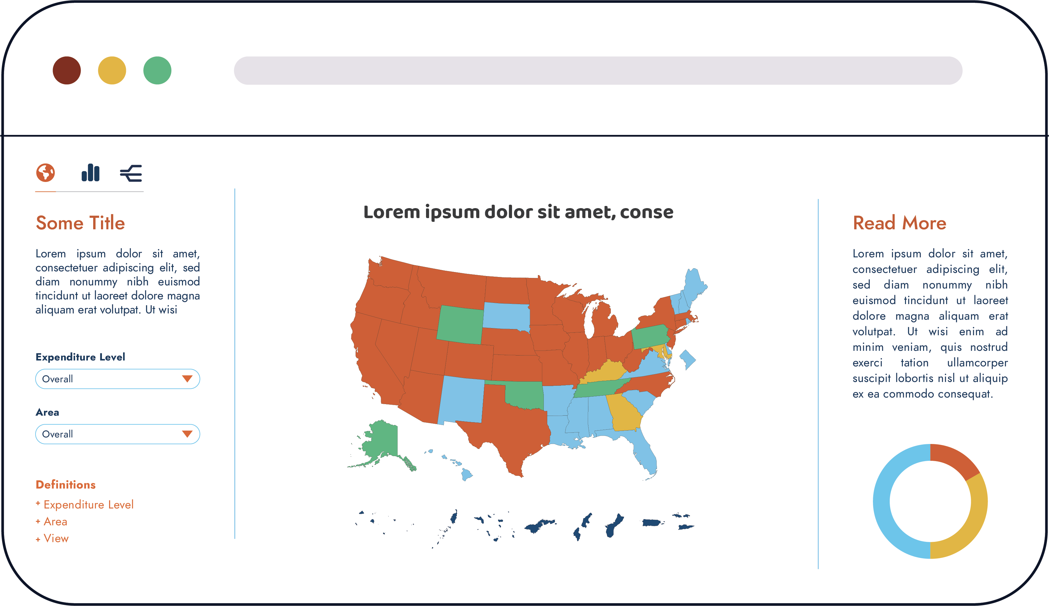
Modern Users

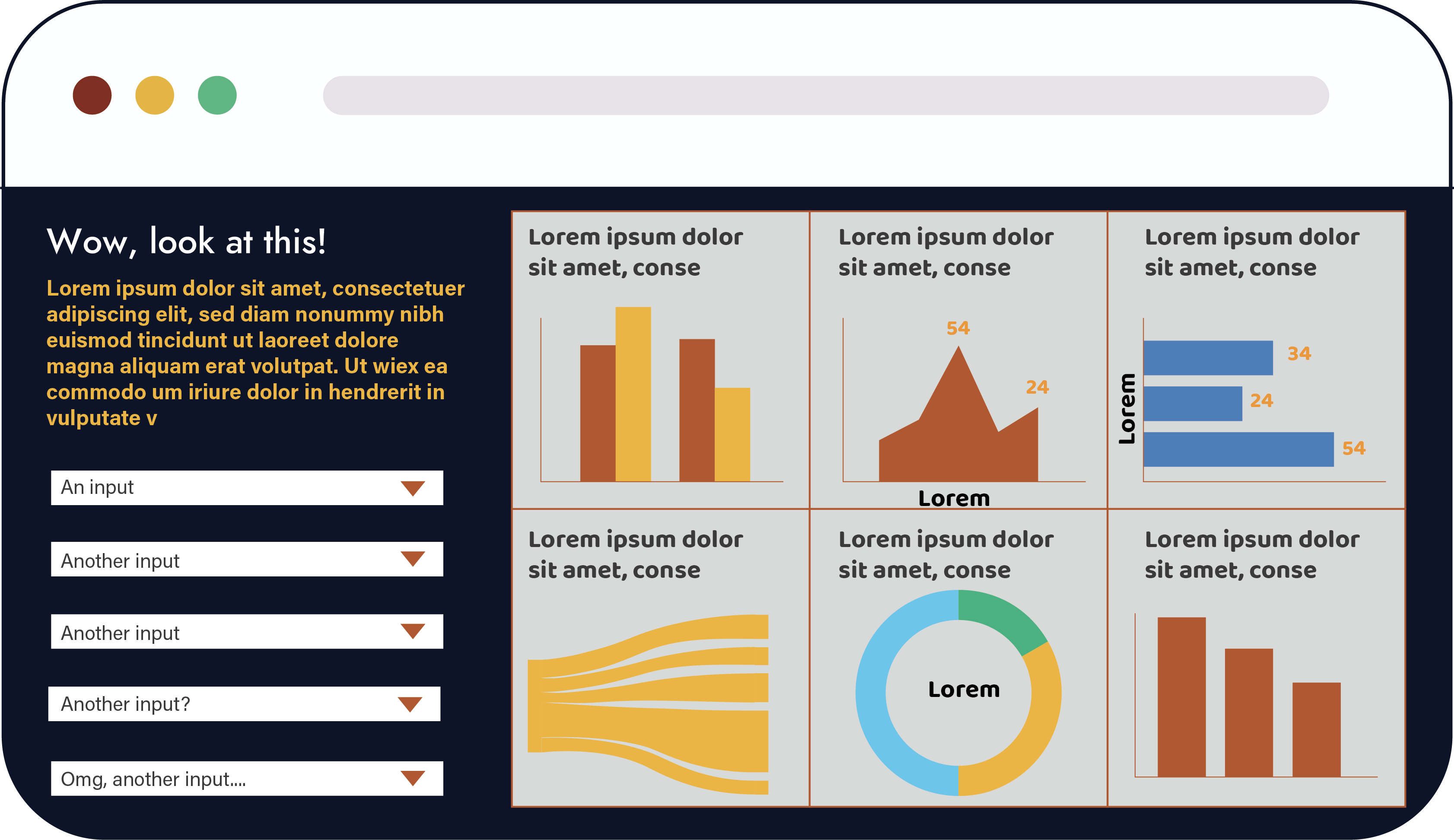


Profile Dashboard
 }
}
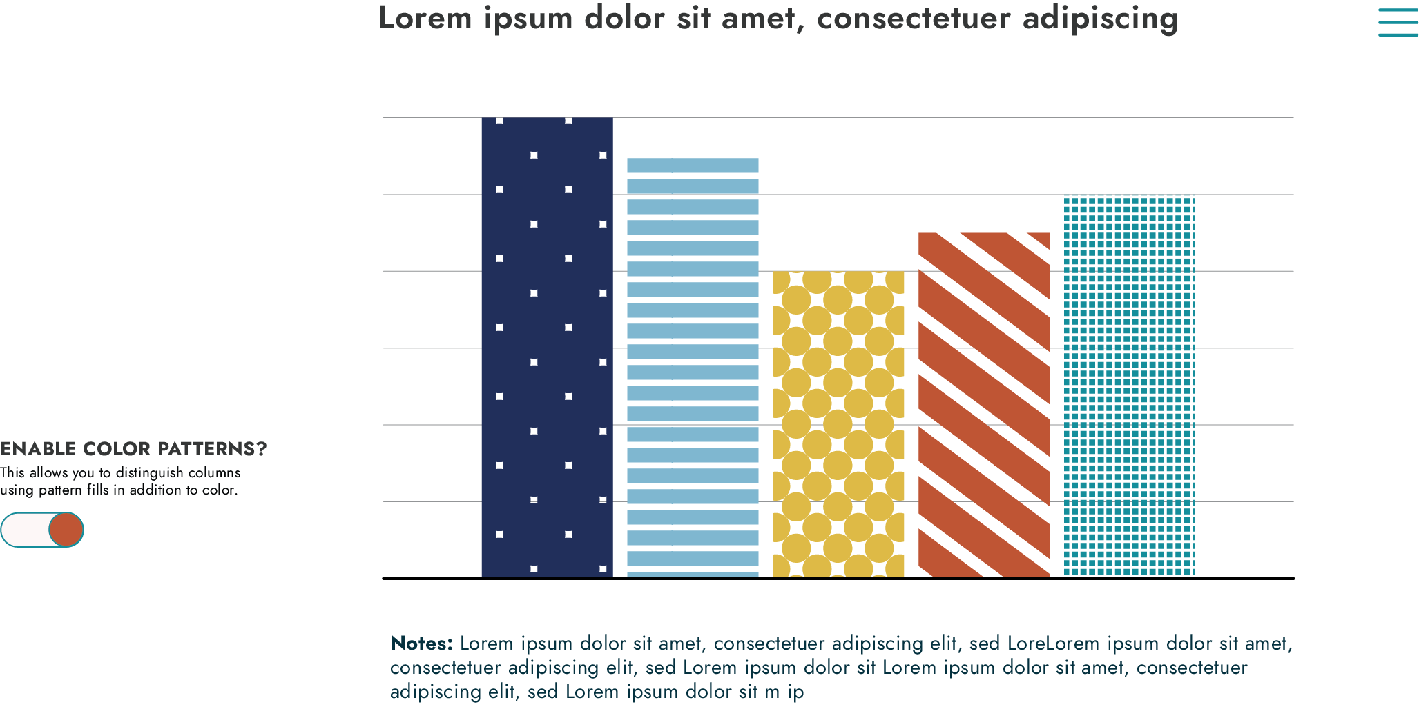
- Add a toggle to overlay bars and maps with a pattern to enhance accessibility and b/w printing.
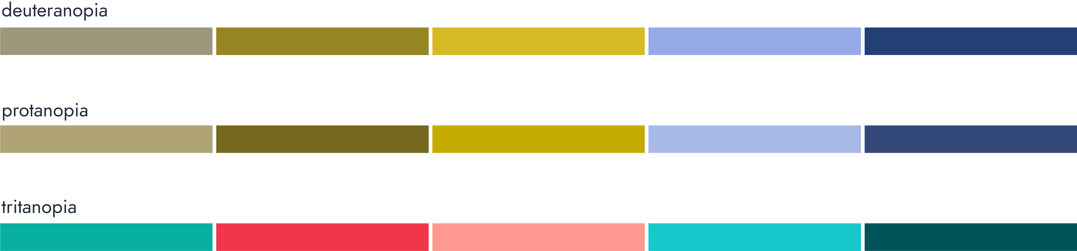
- Enhance accessibility for ADA compliance.
- Increase mobile friendliness.
- Allow users to create their own comparison groups.
- Continue adding data stories.
- Support open source.

Questions?
![]()